Home/Portflio
About
Web Design Referral Project
Contact
Client Design Exercise
Having collected data on Shambarber and their potential competitors I then went on to look at colour themes, type fonts, and images to enable me to experiment and potentially come up with a combination that I thought could be a winning formula.
The picture above and to the right is a collection of colours that were used for one of Shambarbers flyers, I took samples of the colours used using the eye dropper tool to reference what code the colours were. I wanted to stick with Shambarbers current colour scheme as I believe diversifying would only confuse people and in such an early stage of branding thought entirely unnecessary. I used the font type 'Roboto' as I thought it had a clean feel to it, it's clear to read and is, in my opinion, very striking to the eye.


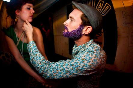
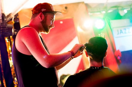
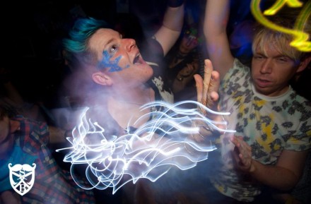
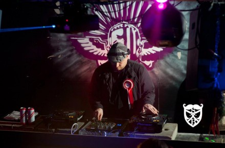
What was made very clear, emphasised by research in to Shambarbers Facebook page, is that they want to get across that they are very much in to the party scene. Having looked through some photos it made it very clear in my mind that having a strong page/link for music, music events and socialising is on the same priority level as the hair styling. This, however brought attention to the fact that people need to be able to trust in their hairdresser and promoting two very contrasting niches wouldn't be too simple. This threw me back a little when trying to design their page. The need to pull in a younger crowd and to have their respect also, was a tricky prospect.
Above is my initial layout for the Shambarber website I've included their logo and stuck with the original font for 'Shambarber' apart from cutting lines out of it, just to add effect. In addition i've added their slogan at the bottom of the page "Barbering. Banter. Beats.".
Designed by Samuel Fraser - 12040705
MMS Portfolio
3D Island